Hi everyone!
Been so long! I painted a mural a couple weeks ago and neglected to post it here... it just ended up as an album on my Talking Walls facebook. That one was a fun little flowery garden shed. Buuuut then I painted this next one, and decided it was time to get back on the blog train again, so here we are.
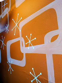
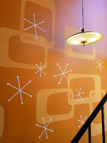
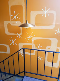
This one is a bit outside my norm. So.... GRAPHIC! This was definitely mind-meld of my two jobs: graphic designer and muralist. Loved it.
I love helping my clients along, when it comes to dreaming up a vision for their space. Of course I have my own opinions and aesthetic, but it's like I always say: they are not. my. walls. You, dear clients, must live with them. I am here to help you decide, and eventually execute, what you would like them to look like.
This particular client manages an apartment complex, with a lobby that needed some life. She liked the whole mid-century vibe. She needed some help to take her the rest of the way there. I definitely helped the most just in cheering her on, as she made decisions. Yes, you are right, bright orange WOULD be the perfect color for your entire apartment complex lobby! (Orange is my favorite color, so duh.) And yes, mid-century modern DOES call for design that is both very simple and extremely playful and fun. And those atomic starburst things are the funnest.
Sometimes people just need permission from someone else to make bold decisions. :)


